“Strong brand identity” sounds like something only big brands can afford. It’s not.
Brands with strong brand identity do one thing better than everyone else: they ship the same decisions again and again. Across the website. Across the product. Across social. Across email. Across the deck that closes the deal.
This post breaks down what “strong” actually means, the patterns you can steal, and a framework you can apply in one afternoon.
If you want the shortcut
Run the questionnaire, then store answers in a template. Those two docs are your identity foundation.
What “Strong Brand Identity” Actually Means
Strong identity is not just “good design.” It’s distinctiveness + consistency.
- Distinctiveness means people can pick you out in a scroll.
- Consistency means your assets feel like one company, even when different people ship them.
When those two are true, buyers spend less time decoding you and more time deciding.

The 6 Signals You See in Brands With Strong Brand Identity
If you study strong brands, you’ll notice the same signals repeating. Not because it’s trendy. Because it makes decision-making fast.
- Signal 1
- A clear category: people know what you are without effort.
- Signal 2
- One promise + proof: the headline stays stable and the supporting points repeat everywhere.
- Signal 3
- Distinctive assets: logo, color, type, layout patterns that feel uniquely yours.
- Signal 4
- Constraints: a small palette, a tight type scale, limited component styles.
- Signal 5
- Cross-channel reuse: the website, product UI, and marketing all feel related.
- Signal 6
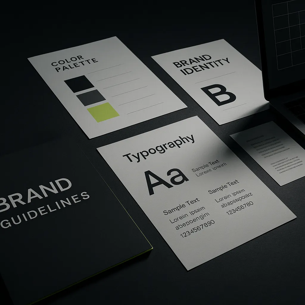
- Documentation: not a fancy PDF, but a usable set of rules + examples.
Pattern 1: They Own a Category in Plain Language
Strong brand identity starts before visuals. It starts with a sentence.
Weak positioning uses adjectives to hide uncertainty. Strong positioning uses nouns to make the category obvious.
- Bad: “A next-generation platform for modern teams.”
- Better: “An invoicing tool for freelancers who bill monthly retainers.”
Want a clean definition of brand basics? The American Marketing Association’s branding overview is a solid reference point. AMA: Branding.

Pattern 2: They Repeat a Message Hierarchy (No Freelance Copy)
Brands with strong brand identity don’t rewrite their story every time they ship an asset.
They keep a stable hierarchy:
- One promise (headline).
- Three proof points (bullets that recur across pages, ads, and decks).
- Supporting detail (FAQs, specs, pages for deeper readers).
This is why your best brands feel “inevitable.” The language keeps showing up. On purpose.
Pattern 3: They Build Distinctive Assets (Then Protect Them)
Strong brands have assets you can recognize without the logo in the corner.
Depending on your business, those assets might be:
- a specific color used only for actions
- a type style and spacing rhythm
- a repeated layout pattern (hero, cards, dividers)
- a shape language (corners, strokes, outlines)
- a photo treatment (contrast, lighting, framing)
The point: make it learnable. Repetition creates association.
Pattern 4: Their Visual System Is Small (and That’s Why It Works)
Most early teams over-design. They add choices. They add colors. They add components. They add fonts.
Strong identities do the opposite: they remove choices.
- ✓ One accent color (reserved for links, focus, and primary CTAs)
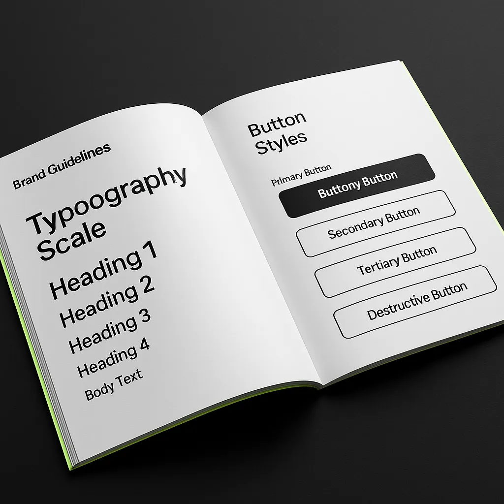
- ✓ Two type families maximum
- ✓ A type scale that stays stable across pages
- ✓ One card style (radius, border, hover)
- ✓ A fixed spacing rhythm (8px works)
- ✓ A small set of components that you reuse everywhere
Accessibility is part of identity, not an afterthought. Contrast rules are the fastest “premium” upgrade because they make the brand readable everywhere. WCAG contrast minimum.
Pattern 5: They Enforce Identity Through Templates
Guidelines don’t scale consistency. Templates do.
Brands with strong brand identity build default layouts for the work they ship weekly. That’s how they stay consistent when output volume increases.
- Website
- Hero + features + proof + FAQ section set. Same structure, different content.
- Social
- Two post layouts: announcement and education. Same type + spacing.
- One header style + one CTA style. Don’t freestyle buttons.
- Deck
- Cover, problem, solution, proof, pricing, next step. One grid.
Pattern 6: They Make the Brand Feel the Same Everywhere
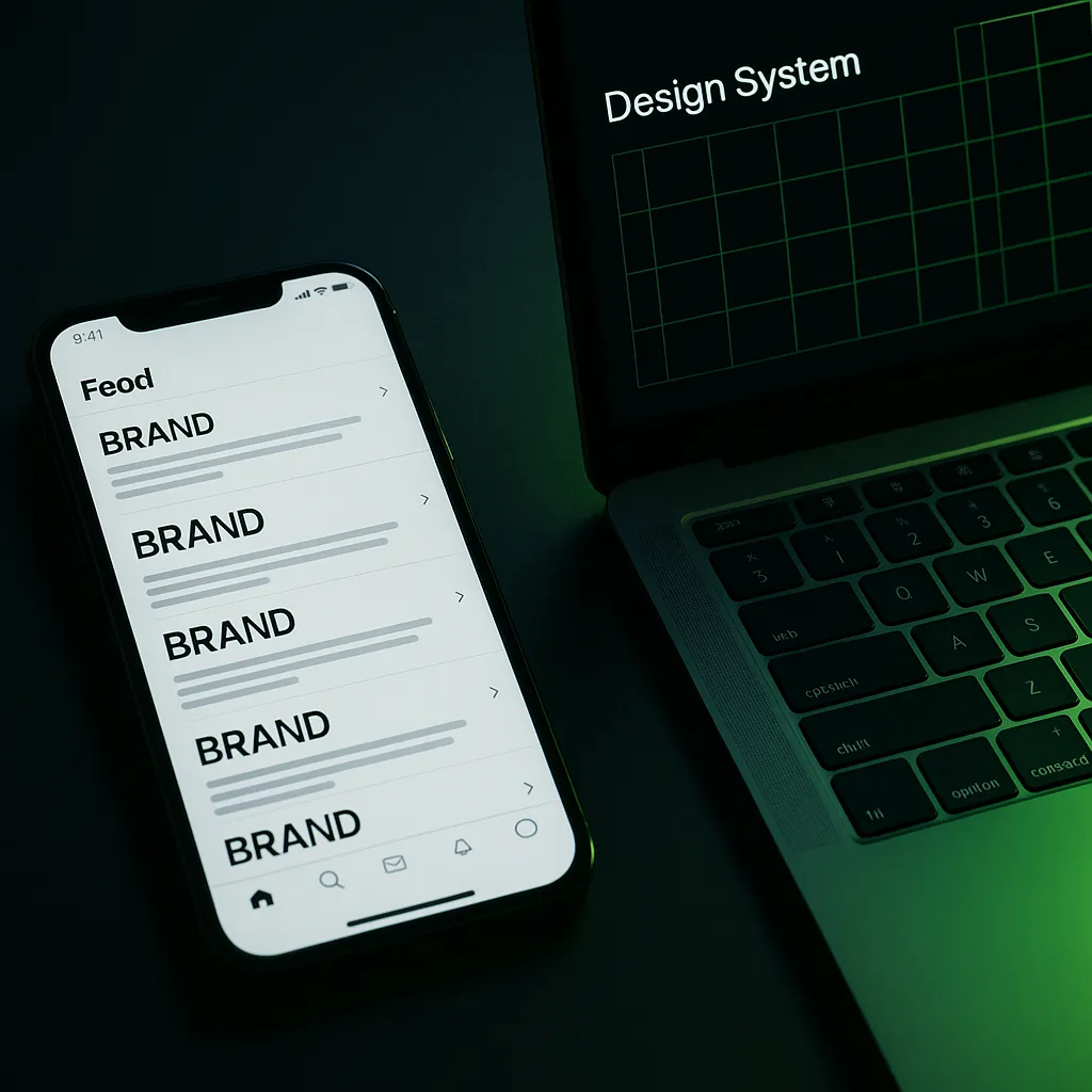
Strong identity is cross-channel. If the product UI feels calm but the marketing site feels chaotic, trust drops.
One practical move: define your component rules (cards, buttons, inputs, dividers) and use them on the marketing site and in-product docs.
A Simple Framework to Build a Strong Brand Identity (In One Afternoon)
If you want to build what strong brands have, don’t start by browsing logos. Start by locking defaults.
- Step 1
- Write one-sentence positioning: category + audience + outcome + differentiation.
- Step 2
- Freeze your message hierarchy: one promise + three proof points.
- Step 3
- Define voice rules: 3 do’s, 3 don’ts, and 10 words you avoid.
- Step 4
- Lock visuals: one accent color, two fonts, one type scale, one card style.
- Step 5
- Create templates: one landing page section set + two social layouts.
To make this even easier, use the brand identity questionnaire to produce answers, then store them in the brand identity template.
Common Mistakes (That Break Strong Identity Fast)
- New colors to fix hierarchy → fix the type scale and spacing first.
- Voice is just adjectives → add do/don’t rules and 5 reusable example lines.
- Custom layouts for every page → build a small component set and reuse it.
- Too many CTAs → pick two default CTA verbs and stick to them.
- Ignoring accessibility → if it’s hard to read, it’s hard to trust.
- ✓ Homepage headline stays stable for 30 days
- ✓ One accent color used for interactive elements only
- ✓ Same button styles and hover behavior across pages
- ✓ Same type scale across website, deck, and social templates
- ✓ Two CTA verbs used across the site
- ✓ Contrast and focus states are visible
How Finale Can Help
Finale is a web studio. We build bold, modern sites that load fast and convert.
When your identity is clear, we turn it into a system that holds together in real life: components, templates, motion rules, and a build that stays clean when you scale.
If you’re preparing for a rebuild, start on Finale or email hello@finale.studio.
FAQ
What makes a brand have a strong brand identity?
A strong brand identity is built on clear positioning, a stable message hierarchy, consistent voice rules, and distinctive visual assets that are applied the same way across channels.
Do I need a famous brand to have a strong brand identity?
No. Strong identity is about repeatable decisions and consistency, not budget. Small teams win by choosing defaults and reusing them.
How do I know if my brand identity is weak?
If your headlines and visuals change depending on who made the asset, the system is missing. The fix is to document defaults and build templates that enforce them.
What are distinctive brand assets?
Distinctive assets are recognizable cues that signal your brand quickly, like a logo shape, a color, a type style, a packaging detail, or a repeated layout pattern. The key is using them consistently so people learn the association.
What should I document first in brand guidelines?
Document the rules that prevent the most mistakes: positioning, message hierarchy, voice rules with examples, logo basics, color defaults with contrast guidance, and typography rules.
How long does it take to build a brand identity system?
You can set usable defaults in an hour. A durable system usually takes 1–2 weeks of iteration because you need to apply it to real assets and adjust what breaks.
Images generated for Finale.


